My Chicken & More × Ruckus — Case Study
Chicken, Fish, Eggs… and More
 MY CHICKEN & MORE
SCROLL DOWN
MY CHICKEN & MORE
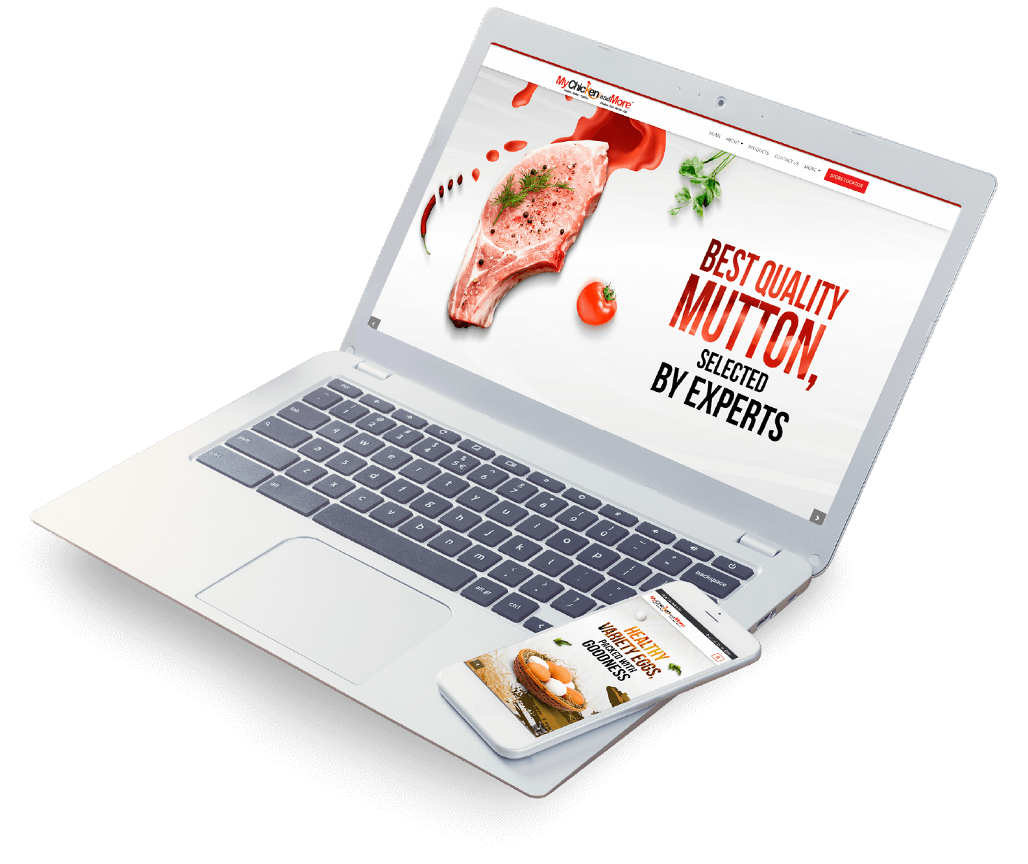
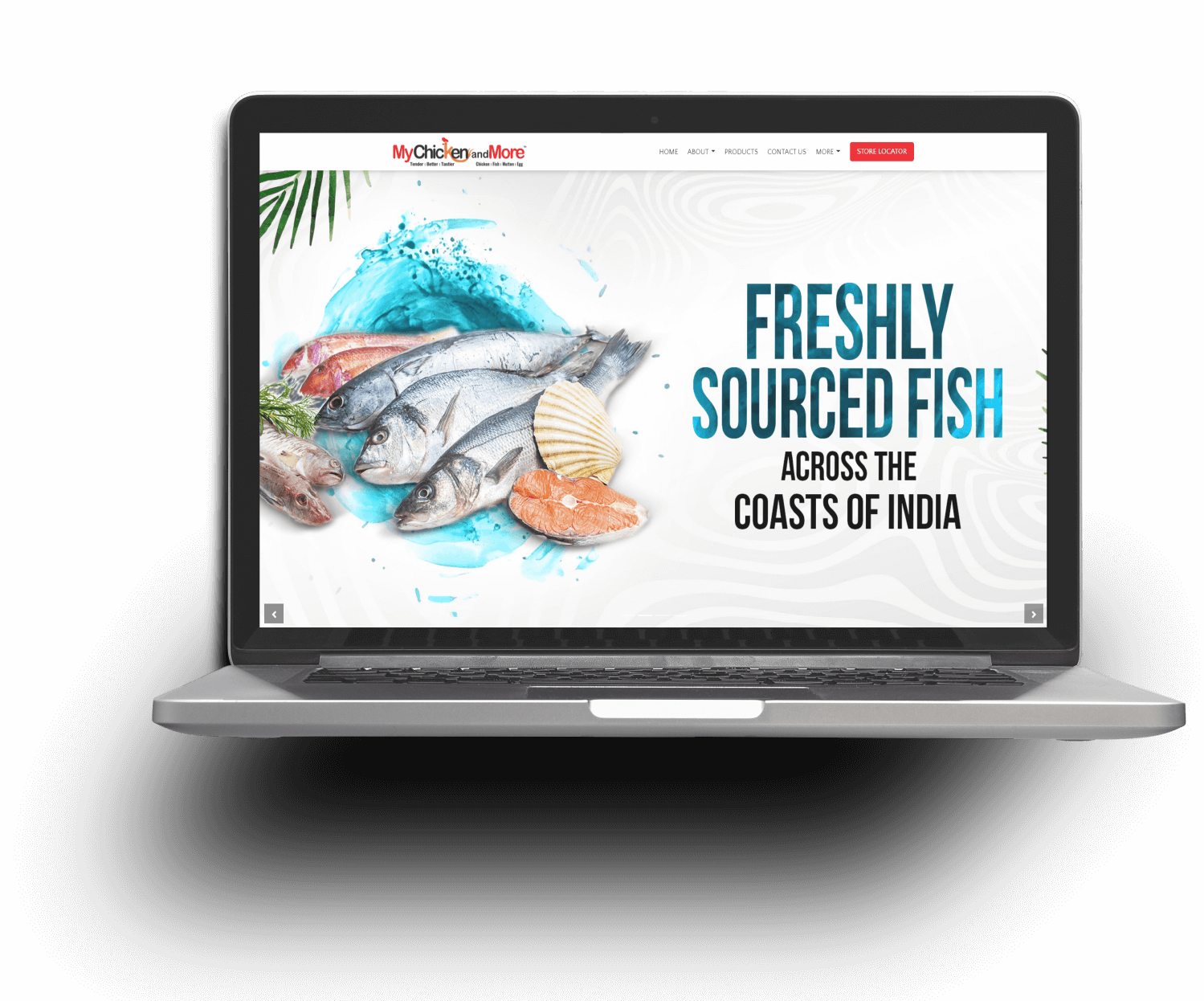
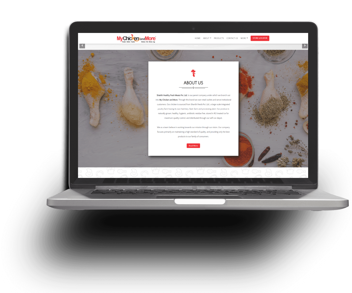
My Chicken & More is a Bangalore-based retail chain specialising in fresh chicken, fish, meat and other protein products. The brand focuses on delivering freshness, hygiene and quality through a modern retail experience.
The objective of the website was to create a digital platform that reflects the brand’s commitment to freshness and quality while allowing customers to explore products, offers and store information easily.
The website was designed to be visually appealing, easy to navigate and fast-loading so users could quickly explore the brand, its outlets, product range and promotions.
The My Chicken & More website was built using a lightweight and performance-oriented technology stack to ensure fast loading and smooth browsing across devices.
Bootstrap and jQuery were used to create an intuitive user interface, while PHP powered the backend functionality. The platform architecture ensures easy navigation and scalability as the brand continues to grow its digital presence.
The design approach focused on creating a website that visually communicates freshness, quality and variety. The platform was structured to make browsing products simple while highlighting the brand’s offerings and store experience.
The website balances strong visual appeal with clear information architecture, ensuring visitors can easily explore products, offers and brand information within just a few clicks.
The UI/UX design focuses on visual appeal and simplicity, ensuring the website reflects the freshness and quality associated with the My Chicken & More brand.
Clean layouts, vibrant imagery and intuitive navigation allow users to easily explore products, learn about the brand and discover store locations.
Customers often browse food brands on mobile devices while searching for nearby stores or product information. The website was therefore designed using a mobile-first approach.
Responsive layouts ensure the platform performs consistently across smartphones, tablets and desktop screens while maintaining fast loading speeds and smooth navigation.
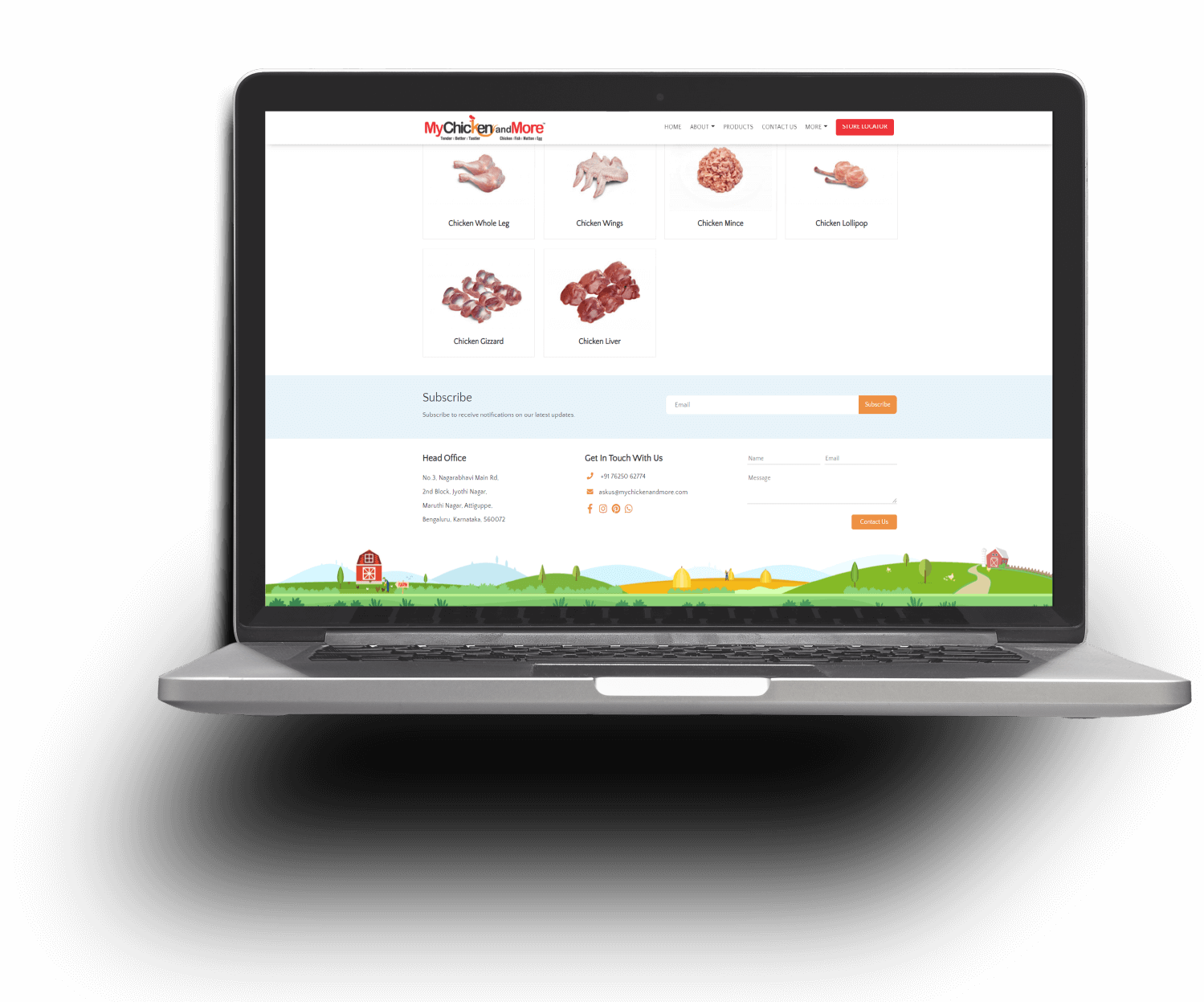
The My Chicken & More website integrates several features that help customers explore products, discover store locations and learn more about the brand.
Since its launch, the website has successfully strengthened My Chicken & More’s digital presence. Customers actively explore the website to discover products, learn about offers and connect with nearby outlets.
By combining strong visual design with clear product presentation, Ruckus delivered a website that reflects the freshness and quality of the My Chicken & More brand.
The platform now serves as an important digital touchpoint for customers, helping the brand build awareness and connect with a wider audience.