
A jewellery brand identity, carried from the logo into print advertising, exhibition hoardings and packaging.

Project Overview
One jewellery house. One mark. Every surface it appears on.
Khushi Jewellers LLC is a Dubai jewellery house. Ruckus’ work for it, as documented in the original case study, covers branding, identity and packaging, extended into print advertising and hoardings.
This case study walks through that work in the order a customer might meet it: the logo, the advertising, the exhibition hoardings and, finally, the bag and boxes the jewellery leaves the shop in. 10 pieces of artwork are shown, plus the logo.
The original deck documents the work itself rather than a written brief or results, so this page does the same.
Services
- Branding
- Identity
- Packaging
- Print advertising
- Hoardings
Industry
- Jewellery
Scale of services
- Dubai
Client Khushi Jewellers LLC
Project Brand identity, packaging & print
In the brand’s own words
Three short lines recur across the artwork.
They are quoted from the creatives themselves: the logo’s sign-off, a print campaign line and a sign-off on the portrait ads.
“embodying you”
On the logo
“inspired by you”
On two print ads; ‘inspired’ recurs on the packaging
“Ode to beauty”
On the portrait and hoarding ads
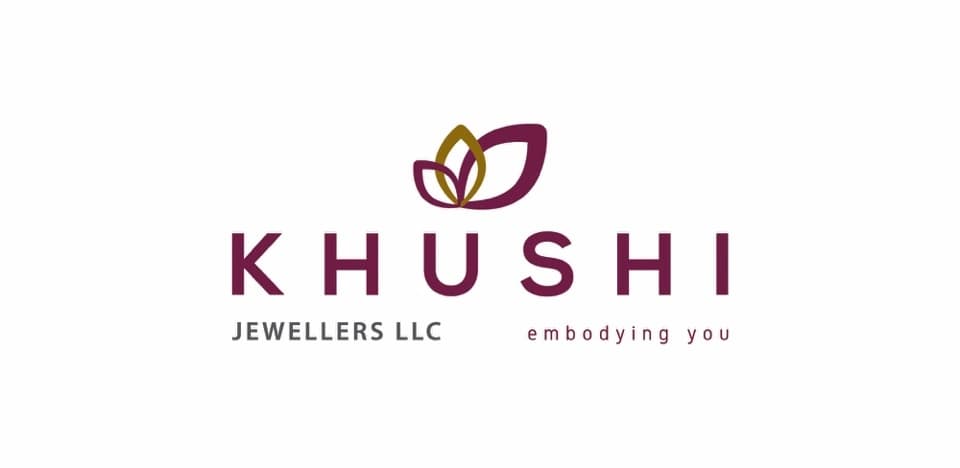
The rebrand puts a petal-like mark in plum and gold above a widely spaced KHUSHI wordmark, and closes with a plain sign-off: “embodying you”.
Plum and gold are the two colours that recur through the rest of this page — in the print footers, on the bag and across the packaging pattern.
- 01
The mark
Two petal shapes, one plum and one gold, set above the name.
- 02
The wordmark
Capital letters with generous tracking, in plum, with ‘Jewellers LLC’ set smaller beneath.
- 03
The sign-off
A lowercase line — ‘embodying you’ — that sits with the logo wherever it appears.
Source: Original Ruckus Jewellery case study, slide 8 (“Logo rebranding”). The deck shows the new logo only, so no before-and-after is claimed.
What the work shows
The deck has no strategy slide, so these three threads are read directly from the artwork — what it consistently does, from page to hoarding to box.
- 01
Worn, not displayed
Most print ads are portraits: the piece is shown on a person, with the collection name set small beside the logo.
- 02
One mark, everywhere
The same logo, colours and petal motif carry from the ad footers to the shopping bag and the boxes.
- 03
Marked by the season
Bridal collections, a New Year greeting and Diwali exhibitions give the advertising a calendar to follow.
Two bridal collections and a seasonal greeting, each led by a portrait. The logo, a collection name and the showroom details are all kept to the edges.
Print advertisement
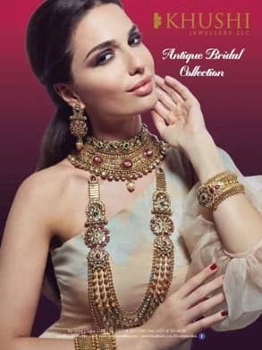
Antique Bridal Collection
A bridal portrait in magenta and gold; the collection name sits quietly beside the logo.
Print advertisement
Diamond Bridal Collection
A close crop on the hands and face, with the jewellery framed by the pose.

Greeting advertisement
Wishes you a happy New Year
A seasonal greeting built on the same portrait format as the collection ads.
Source: Original Ruckus Jewellery case study, slide 6. No circulation, reach or response figures are given in the source.
Print advertisements · a campaign line
A pair of ads share a handwritten ‘inspired by you’ and a white footer with the logo. One sets kundan jewels into a rustic vessel on black; the other lays silver earrings on slate beside white flowers, with a row of rings below.
The same script reappears on the shopping bag and the boxes, which is how the campaign line meets the packaging.

Print advertisement
Inspired by you — kundan
Jewels set into a rustic vessel against black: the piece as an object, not a portrait.

Print advertisement
Inspired by you — rings
A lighter, whiter take on the same line, with a row of rings in the footer.
Source: Original Ruckus Jewellery case study, slide 9.
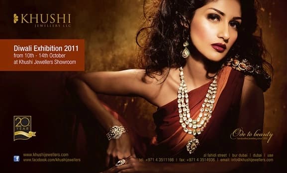
For Diwali exhibitions the brief moved to large formats: one portrait, one landscape. The invitation and dates are given room, but the necklace stays the focal point.

Hoarding artwork
Visit Khushi’s sparkling Diwali exhibition
The jewellery is the hero; the invitation is set in a dark corner above it.
Hoarding artwork
Diwali Exhibition 2011
A landscape format with an orange information panel and a ‘20 years’ badge.
Source: Original Ruckus Jewellery case study, slide 7. Exhibition details are those printed in the artwork and are historical.
Brand identity · packaging
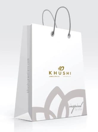
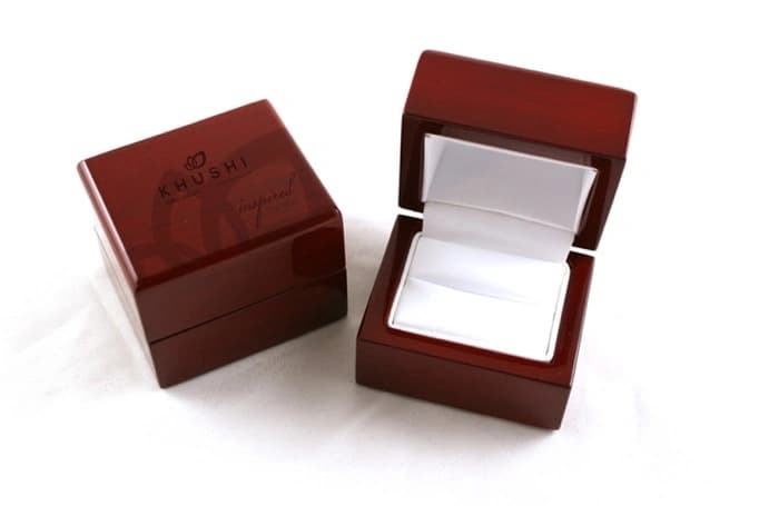
The bag, the necklace box and the ring box carry the petal motif and the script from the advertising into something customers hold. Each is shown as the deck presents it.
Brand identity · Shopping bag
The shopping bag
A white bag where the logo is small and the petal pattern does the talking.

Brand identity · Necklace box
The necklace box
Tone-on-tone petals and the logo on cream, so the necklace is the only colour.
Brand identity · Ring box
The ring box
A glossy dark wood box with the logo on the lid. The deck labels this slide ‘necklace box’; the image shows a ring box.
Source: Original Ruckus Jewellery case study, slides 10–12.
Scope of work
The source documents the output, not business results. The numbers here count artwork shown in the deck; they are not outcomes.
- 1
- Logo rebrand
- 5
- Print advertisements
- 2
- Hoarding creatives
- 3
- Packaging pieces: a bag and two boxes
Source: Counts of items shown in the original Ruckus Jewellery case study. It reports no sales, footfall, reach or ROI, and none are implied.
Closing
From the logo to the last box lid.
The Khushi work follows a piece of jewellery from the page to the hoarding to the bag it leaves in, with one mark and one set of colours throughout.