
UI/UX strategy and website design for Prestige Clubs, shaping a clearer digital journey across five clubs, memberships and day outings.

The Project
Five distinct club experiences. One cohesive digital destination.
Prestige Clubs brings together five clubs across Bengaluru and Hyderabad. The digital experience needed to make the membership proposition clear while helping visitors discover the clubs and choose how to enjoy them.
Services
- UX strategy
- Information architecture
- UI/UX design
- Responsive web design
- Website development
Industry
- Hospitality
- Lifestyle
- Recreation
Platform
- Next.js 16 (App Router)
- TypeScript 5.9 (strict)
- Tailwind CSS 4 (PostCSS)
- Framer Motion
Client Prestige Clubs
Scope Frontend UI/UX revamp
The challenge
With five clubs, two cities and a broad mix of activities and hospitality, the task was to organise a diverse offering into one coherent website: communicate the value of membership, help visitors explore the clubs, and make the difference between membership and day outings easy to see.
These are the project’s design priorities, not findings from earlier usability testing.
- 01ClarityMake the overall proposition understandable from the first screen.
- 02DiscoveryHelp visitors explore the club network and the experiences available.
- 03MembershipGive the central membership proposition a clear and prominent place in the journey.
- 04ChoicePresent membership and day-outing options as distinct ways to experience the clubs.
- 05Visual storytellingUse the available photography and interface composition to communicate the atmosphere of the destination.
- 06Accessibility across devicesMaintain a clear, usable experience across desktop, tablet and mobile layouts.
Chapter 01 · Visual direction
Large photography, a short headline and generous space let the clubs set the tone. The interface stays quiet so the places, the facilities and the next action are the things a visitor notices.
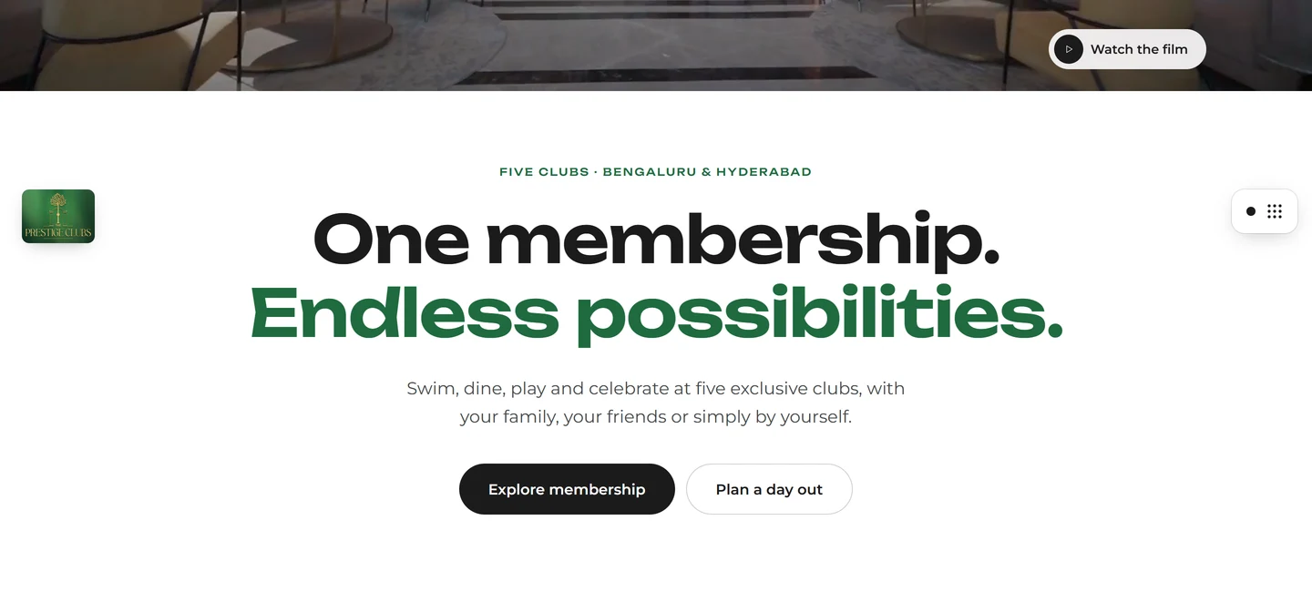
Typography and hierarchy — a clear distinction between the main proposition, the supporting line and the two actions a visitor can take next.
Photography and image composition — architectural photographs carry the atmosphere; the facilities strip adds range without clutter.

Buttons and calls to action — paired actions that separate membership from a day out.

Cards, panels and groupings — each option gets its own photograph, pitch and starting price, so the two can be compared at a glance.
Chapter 02 · The homepage
The homepage moves from proposition to proof to action: what Prestige Clubs is, what membership unlocks, how to join or visit, and where each club is.
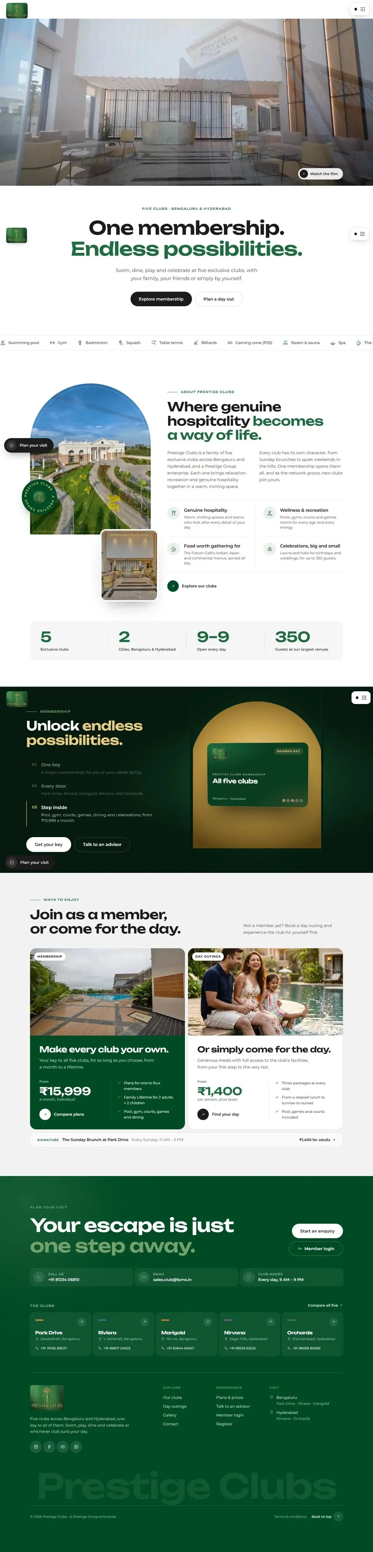
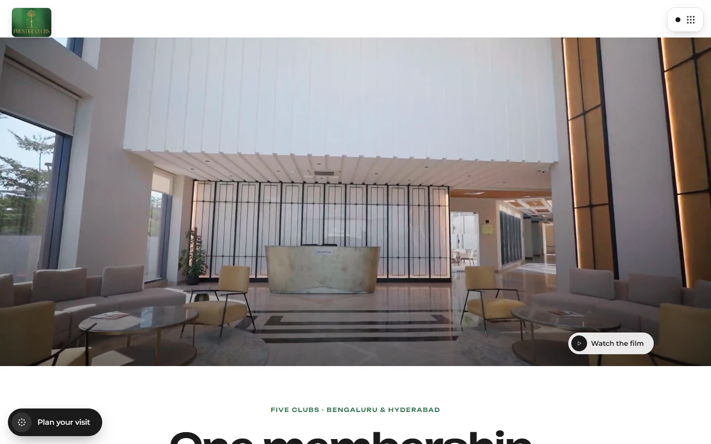
- 01 · The hero
“One membership. Endless possibilities.”
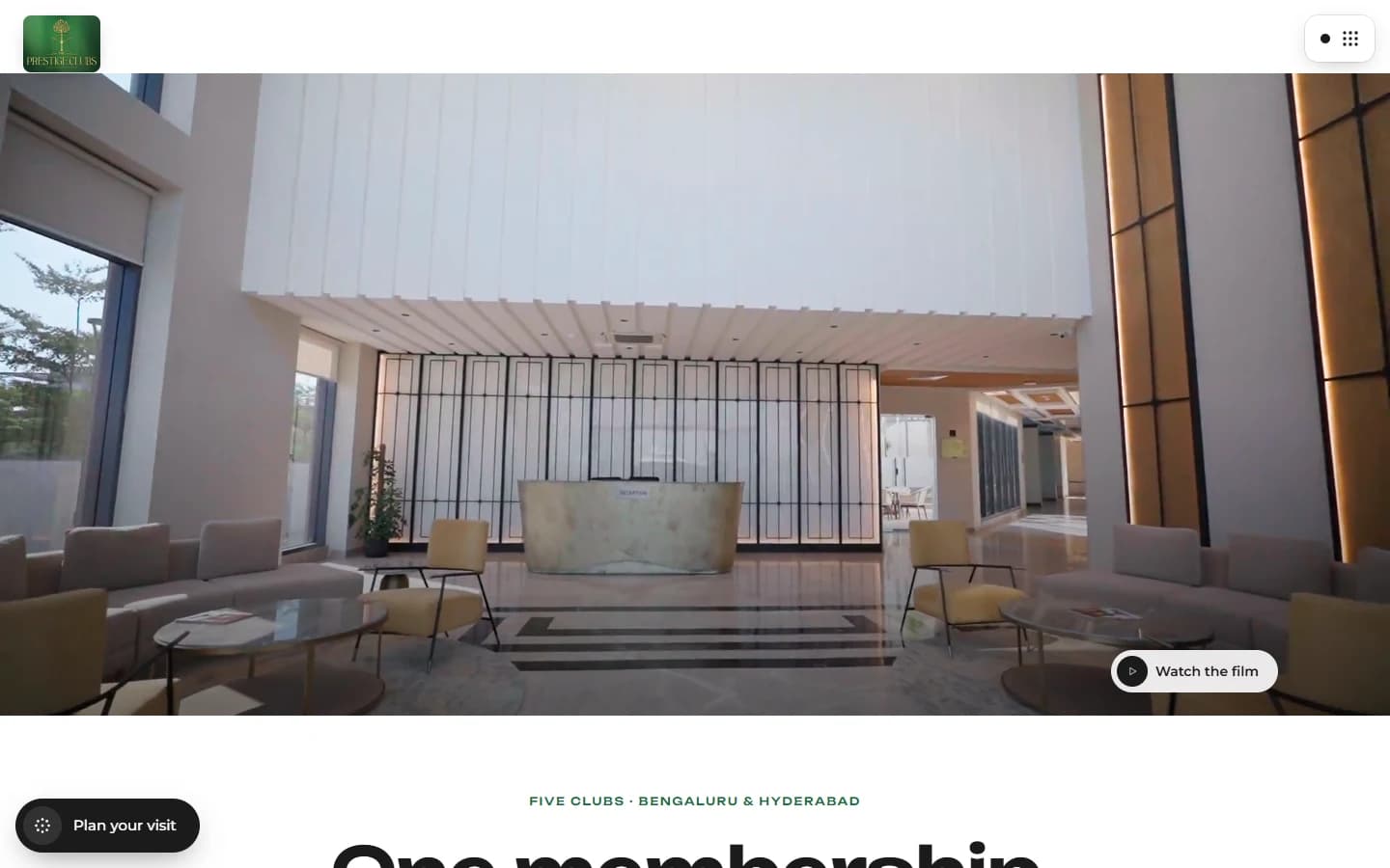
A full-bleed photograph of Park Drive, a single headline, one supporting line and two clear routes: Explore membership and Plan a day out. The first screen states the proposition before asking for any decision.
- 02 · The experience showcase
The breadth of the clubs, in one continuous line
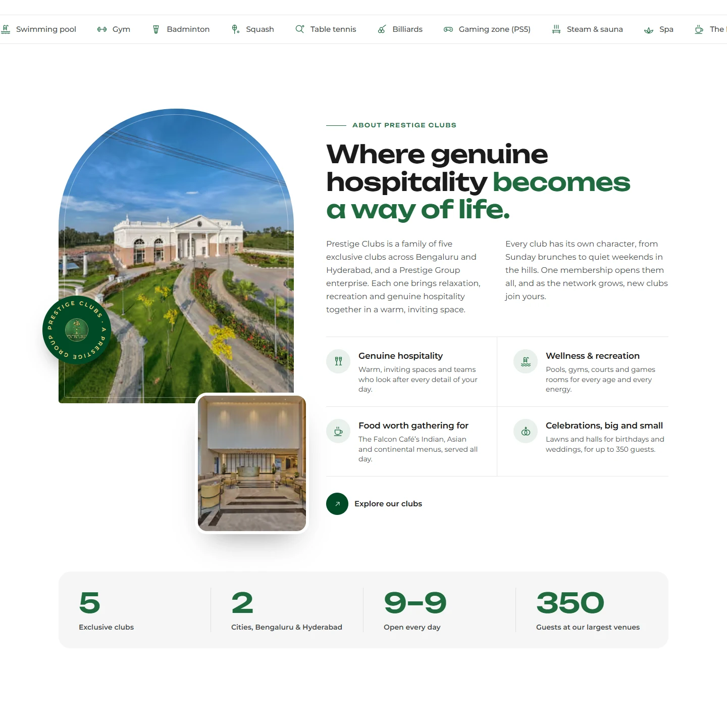
A looping strip lists the facilities — swimming pool, gym, squash, spa, The Falcon Café, banquet halls and more — followed by two architectural photographs. It shows range at a glance without turning the homepage into a feature list.
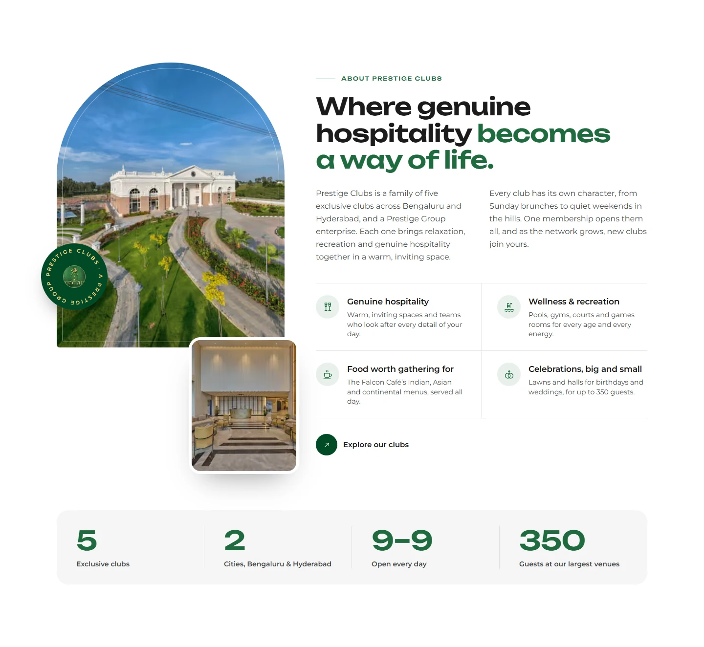
- 03 · About Prestige Clubs
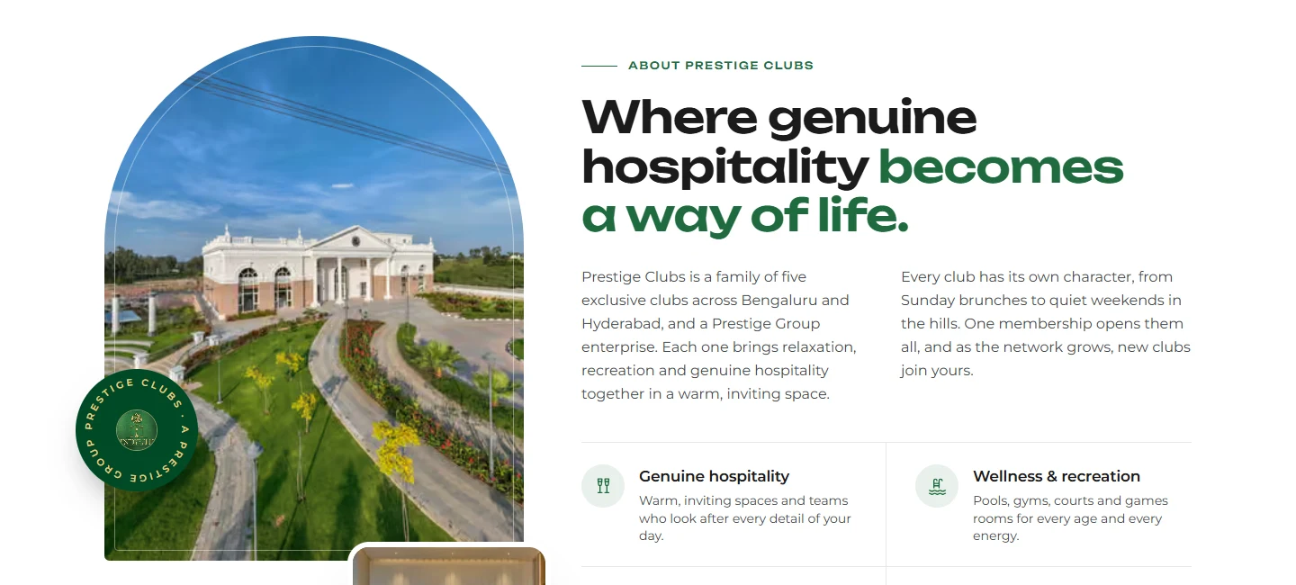
“Where genuine hospitality becomes a way of life.”
The brand story introduces the five-club family and the Prestige Group behind it. Four short value statements and four headline figures give context before the visitor reaches the membership offer.
- 04 · Membership proposition
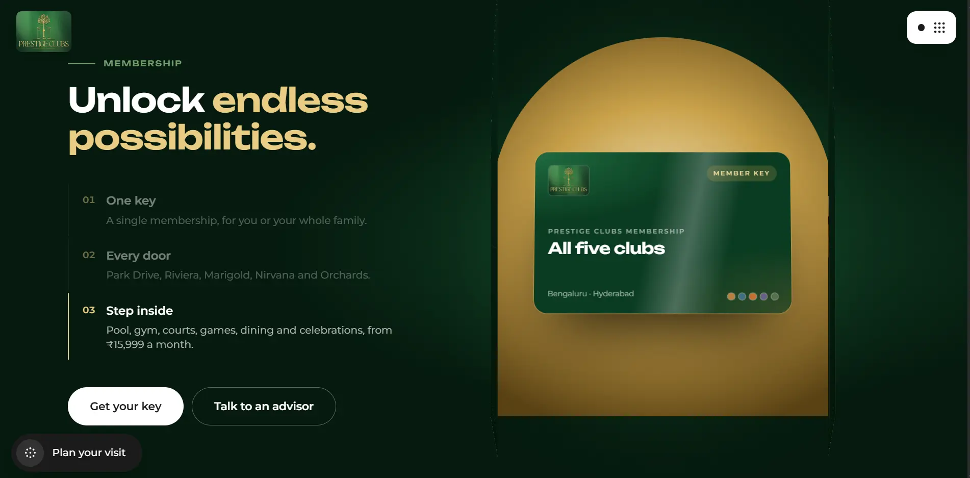
“Unlock endless possibilities.”
Three numbered ideas — One key, Every door, Step inside — introduce one membership across five clubs, paired with a member-key visual and two actions: Get your key and Talk to an advisor.
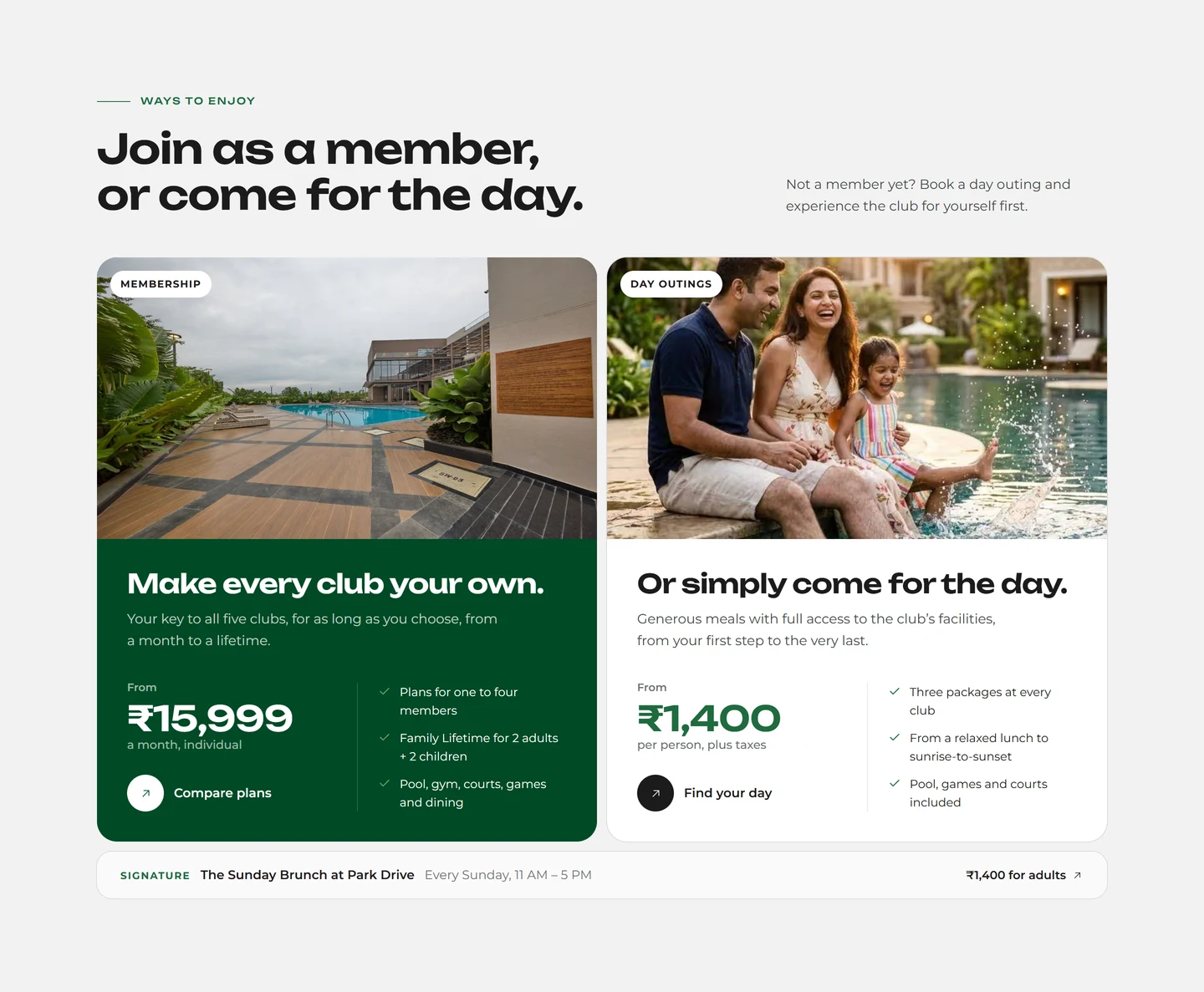
- 05 · Ways to enjoy
“Join as a member, or come for the day.”
Membership and day outings sit side by side as two large panels, each with its own photograph, short pitch and public starting price. Visitors choose a route by intent.
- 06 · Signature experience
The Sunday Brunch at Park Drive
One concrete, named experience — every Sunday, 11 AM to 5 PM — gives the abstract offer a specific moment to picture. It links to the Park Drive club page.
- 07 · Plan your visit
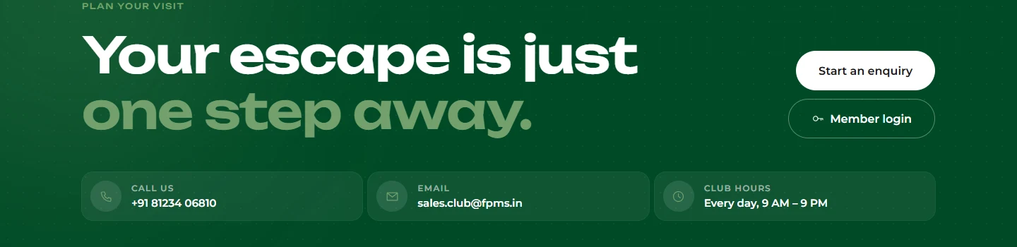
“Your escape is just one step away.”
Start an enquiry and Member login sit together, next to the phone number, email address and daily club hours. The next step is available at the moment a visitor is ready to take it.
- 08 · Club directory and footer
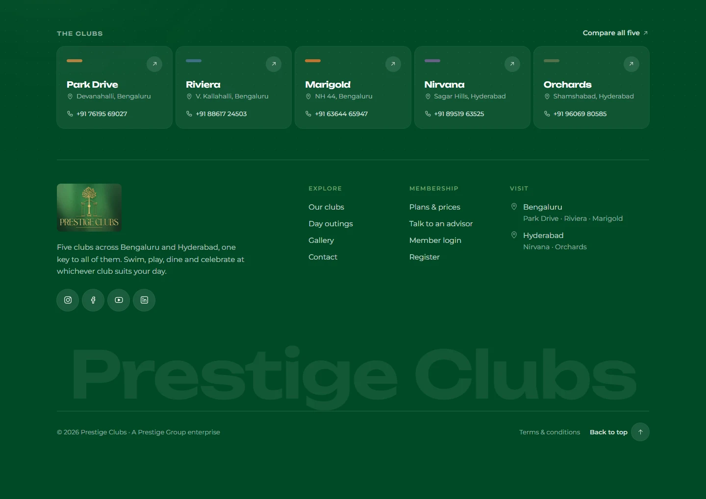
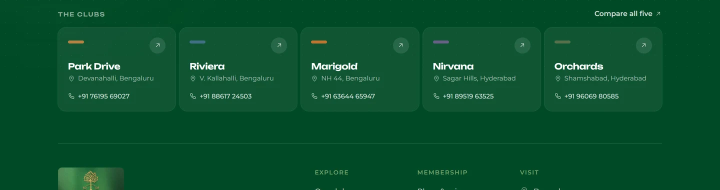
Five clubs, listed with place and phone
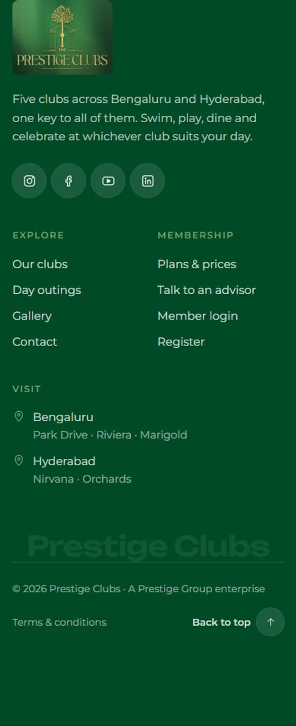
Each club appears with its area and contact number, followed by a footer that groups Explore, Membership and Visit links, with Bengaluru and Hyderabad as separate entry points.
Information architecture
The structure below is drawn from the deployed site’s navigation and footer. Some items are routes of their own; others are sections of the homepage, and are labelled as such.
Home
Prestige Clubs
Brand and discovery
01- About Prestige Clubs (homepage section)
- Our clubs
- Gallery
Membership
02- Membership · plans & prices
- Talk to an advisor (enquiry)
- Member login
- Register
Experiences
03- Day outings
- Signature: Sunday Brunch at Park Drive
- Facilities strip (homepage)
- Celebrations & weddings (homepage section)
Locations
04- Bengaluru — Park Drive, Riviera, Marigold
- Hyderabad — Nirvana, Orchards
- One page per club
Contact and next steps
05- Enquiry form
- Phone and email
- Club hours · every day, 9 AM – 9 PM
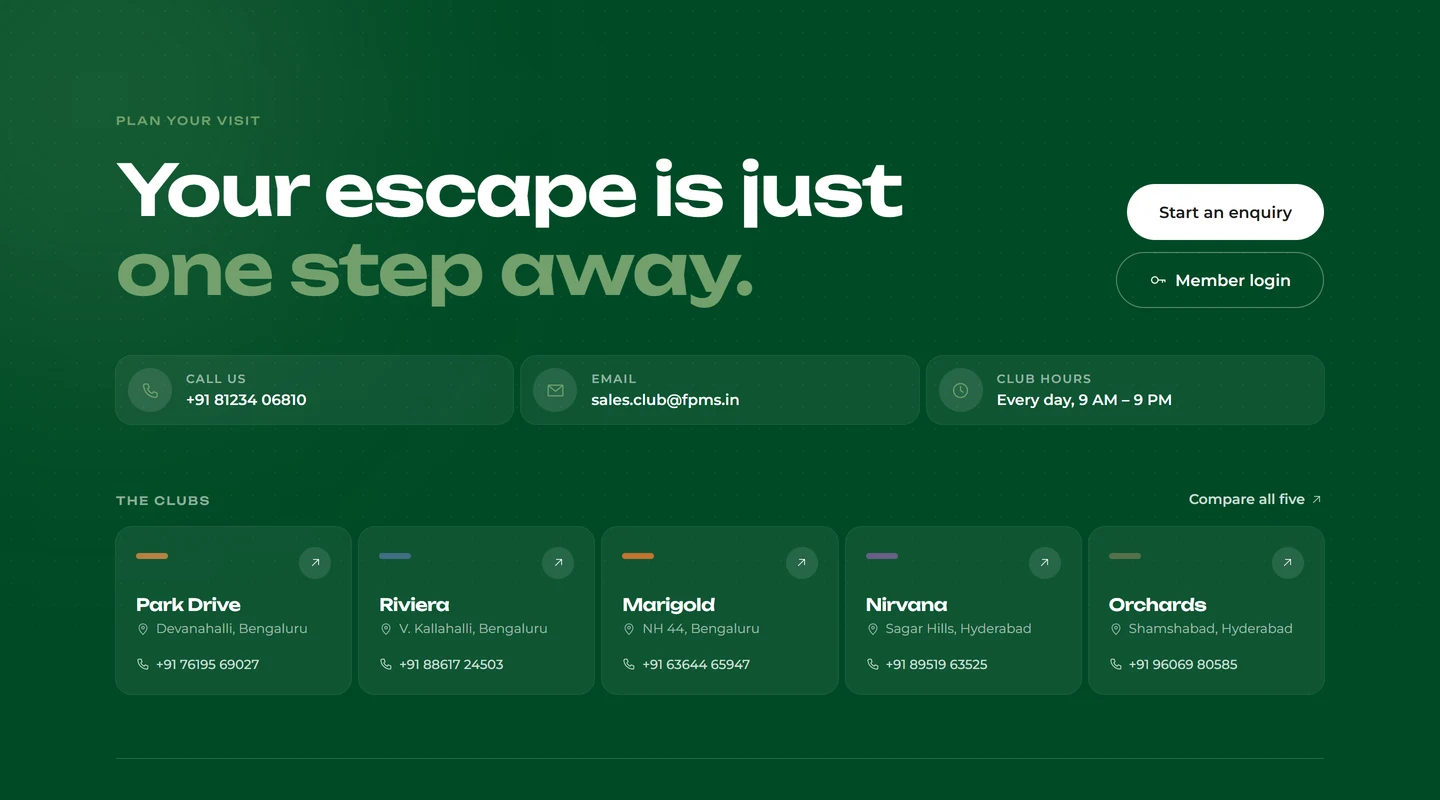
The footer repeats the same structure — Explore, Membership and Visit — as a second route into every group.
Chapter 03 · Membership experience
The section introduces the idea in three short steps — the key, the network, then what is inside — so a visitor grasps the offer before meeting a single facility.
Sequencing the idea lets visitors understand the offer without processing every facility at once.
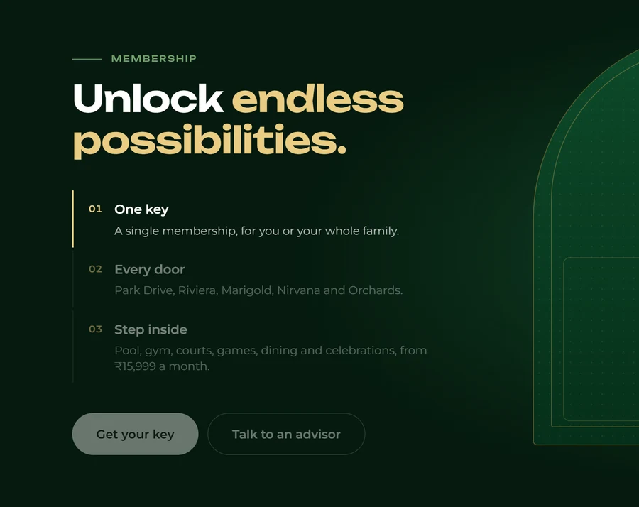
The member key — one object that stands for access to all five clubs.
- 01One keyA single membership, for an individual or the whole family.
- 02Every doorPark Drive, Riviera, Marigold, Nirvana and Orchards, presented as one network.
- 03Step insidePool, gym, courts, games, dining and celebrations — the breadth of what membership includes, shown last.
Chapter 04 · The club network
Five destinations, presented as one connected collection.
Three clubs in Bengaluru, two in Hyderabad. Each has its own page, area and phone number, grouped by city so the network reads as a whole without flattening each club’s identity.
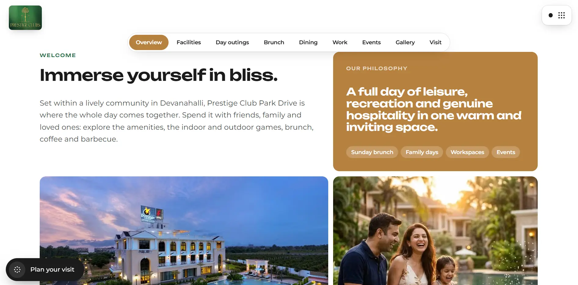
01Park DriveDevanahalli, Bengaluru
The club that opens the homepage, and home to the Sunday Brunch.
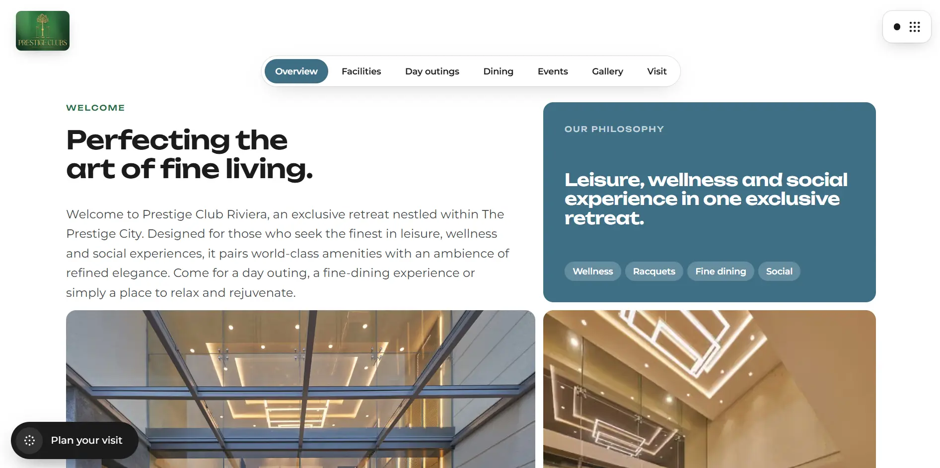
02RivieraV. Kallahalli, Bengaluru
Listed with its own page, area and contact number.
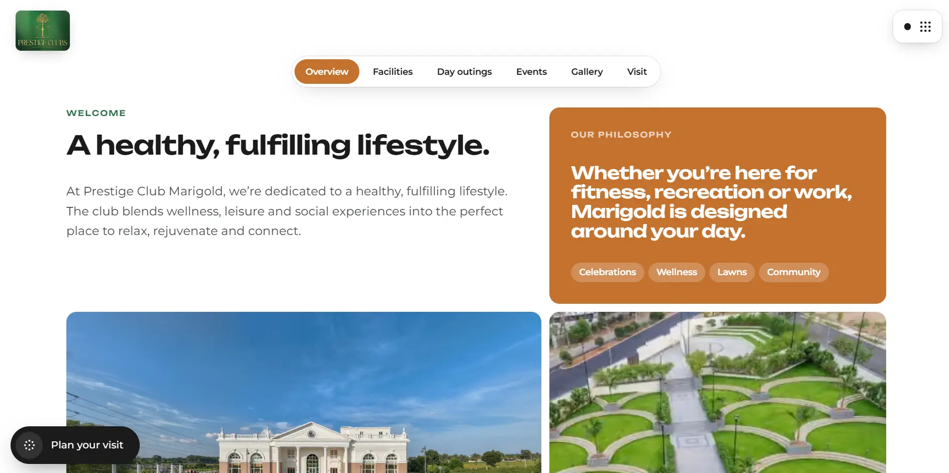
03MarigoldNH 44, Bengaluru
Its colonnaded facade appears in the homepage showcase.
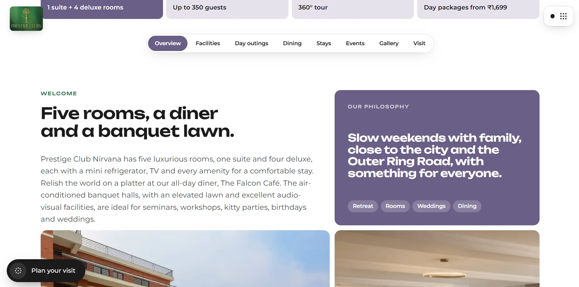
04NirvanaSagar Hills, Hyderabad
One of two Hyderabad clubs, reached from its own city page.
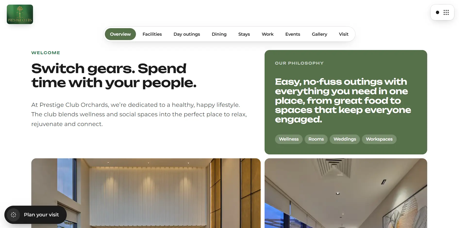
05OrchardsShamshabad, Hyderabad
Its double-height lobby appears in the homepage showcase.
Chapter 05 · Choosing an experience
Members and day visitors are different people with different intents. The interface gives each a distinct panel, message and route, so neither has to decode the other’s offer.
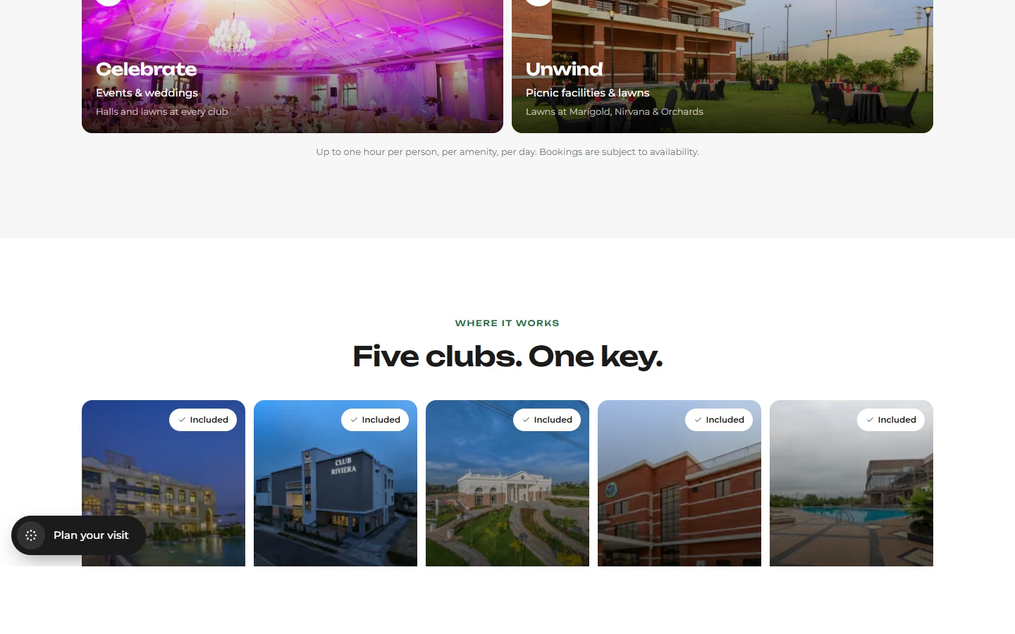
Membership
“Make every club your own.” One key to all five clubs, for a month to a lifetime, with plans for one to four members.
Day outings
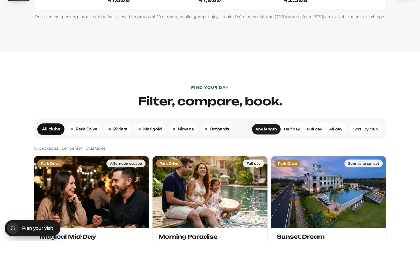
“Or simply come for the day.” Three packages at every club, plus the Sunday Brunch at Park Drive as a named, concrete example.
Starting prices are shown on the public website (membership from ₹15,999 a month; day outings from ₹1,400 per person, plus taxes). They are client content, not project metrics. This case study makes no claim that the site completes a booking or payment.
UI details
Small interface decisions. A more coherent experience.

Navigation
A slim header with the logo and a persistent Plan your visit action.
Primary and secondary actions
Explore membership and Plan a day out are paired as two clear routes.
Member key
A key card with the prompt “Scroll to turn the key” turns the membership idea into an object.

Facilities strip
A looping line of facilities communicates range in a single row.
Ways-to-enjoy panels
Two photo-led panels, each carrying its own starting price and call to action.
Club directory
Name, area and phone number for each club, in one scannable list.
Hero typography
A short headline, a small location label and one supporting sentence set the hierarchy.
Footer navigation
Explore, Membership and Visit groups, with the two cities as separate entry points.
Responsive
One experience, thoughtfully adapted to every screen.
The mobile views are captures of the live responsive site, not scaled-down desktop screenshots.





- Reading order
- Panels that sit side by side on desktop stack into a single column, keeping membership and day outings clearly separate.
- Navigation
- The header keeps the logo and the Plan your visit action visible on small screens.
- Image scaling
- Photography is cropped to fit each viewport while keeping the subject in frame.
- Touch targets
- Calls to action are full-width pill buttons that are easy to tap.
Frontend implementation
The scope was the frontend. Everything below is observable on the deployed site; the case study makes no claim about a backend, booking engine or analytics.
- 01Deployed frontendThe redesign is live and explorable at prestige-clubs.vercel.app, hosted on Vercel.
- 02Route structureSeparate routes for membership, day outings, clubs, gallery and contact, plus one page per club and per city.
- 03Image handlingPhotography is served through the framework’s image optimisation, with responsive sizes.
- 04Skip linkA “Skip to content” link is the first focusable element on the page.
- 05Scroll-linked detailThe member key responds to scrolling, with the prompt “Scroll to turn the key”.
- 06Looping facilities stripA continuous strip of facility names runs along the hero.
The website in full
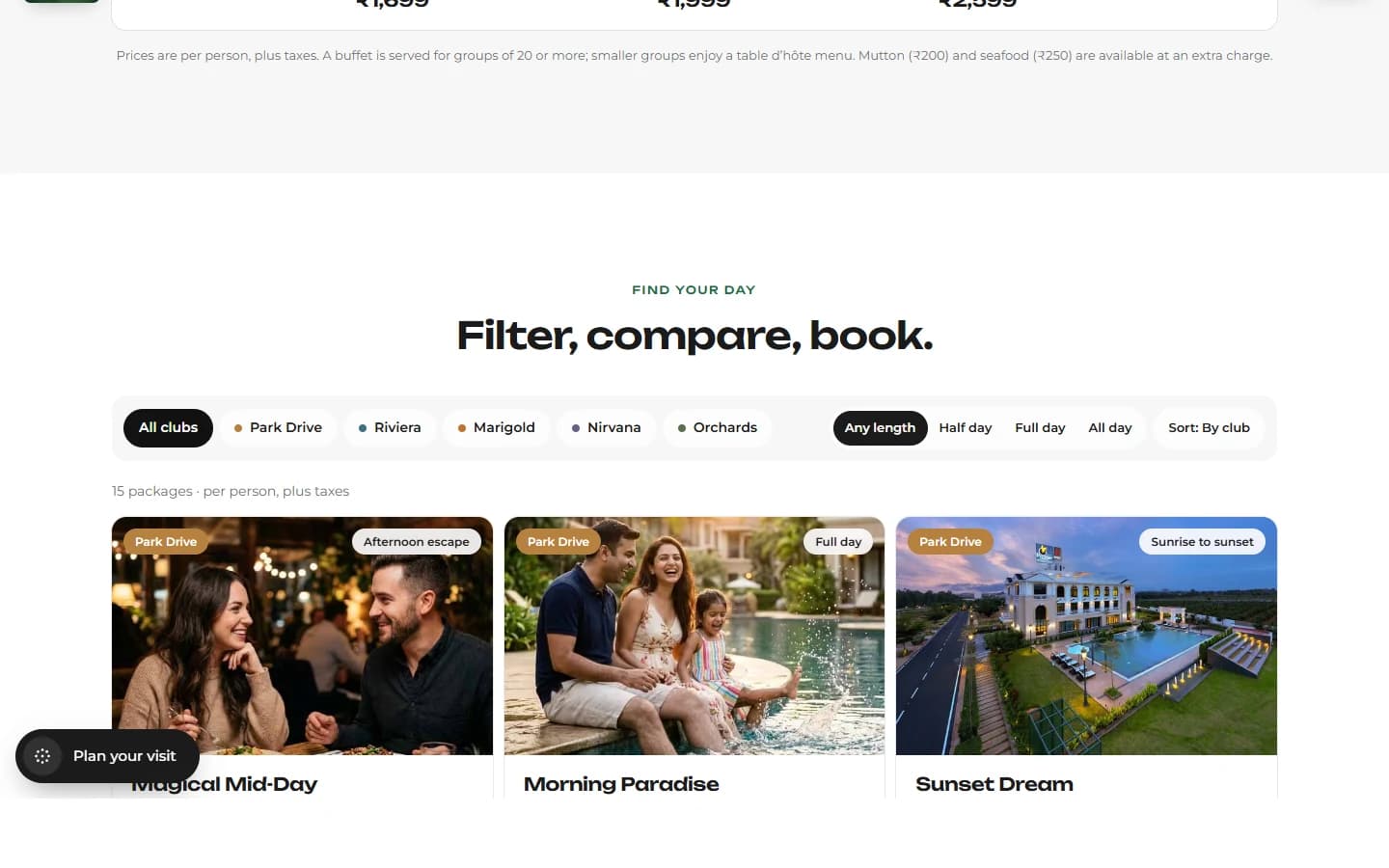
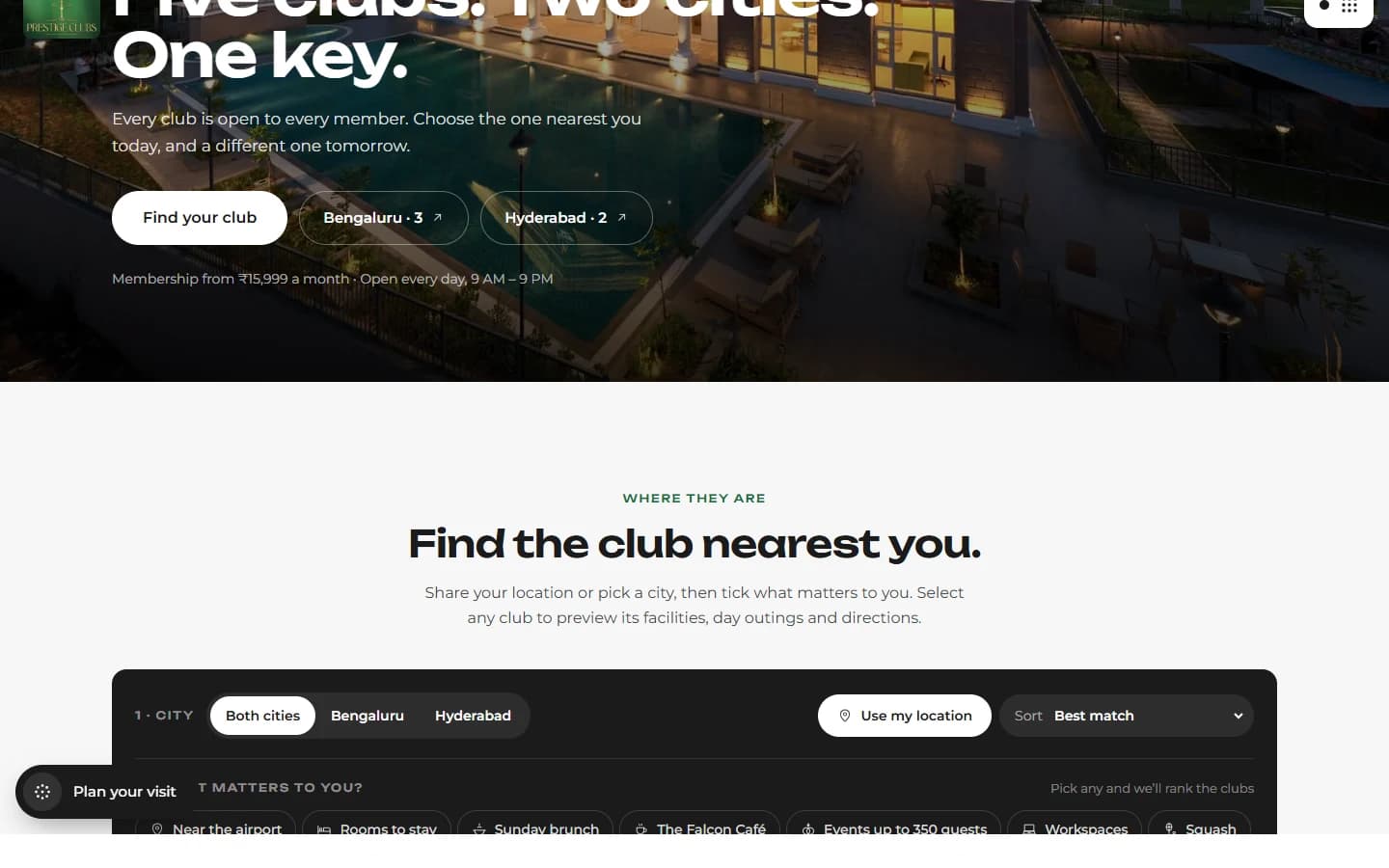
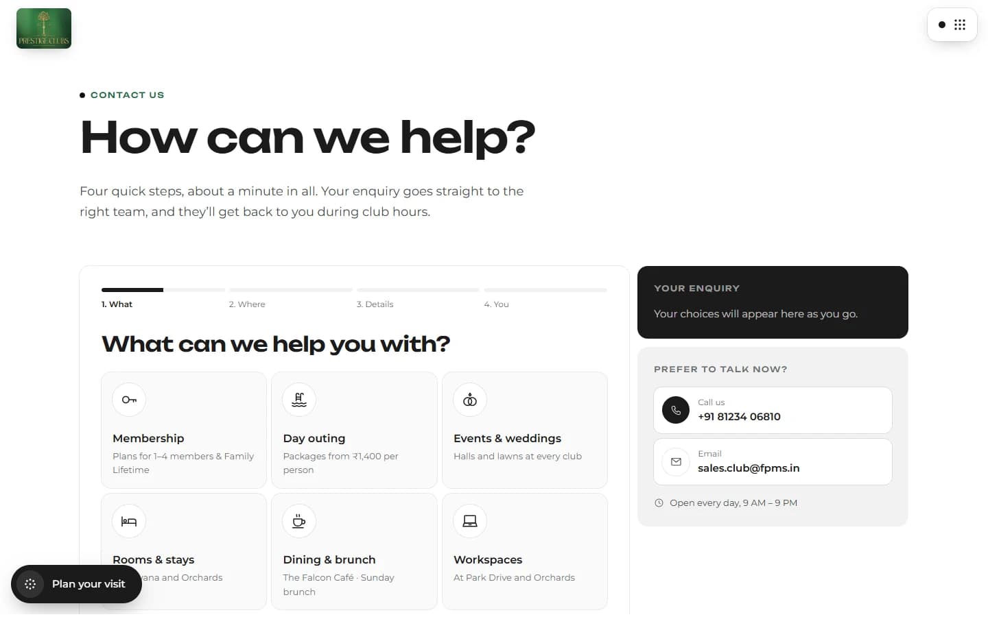
Explore the experience, page by page.


Project outcome
A clearer digital expression of the Prestige Clubs experience.
These are design outcomes visible in the delivered interface. Validating their effect on visitor behaviour would need analytics or user testing, which are outside this case study.
- 01A unified digital presentation for the five-club network.
- 02A clearer introduction to the membership proposition.
- 03Distinct presentation of membership and day outings.
- 04More structured discovery of the clubs and their experiences.
- 05A consistent visual language across the homepage and supporting sections.
- 06A deployed frontend that visitors can explore.
One connected experience.
Five clubs to discover.
A considered digital experience for a hospitality brand built around recreation, connection and memorable moments.