

A structured brand presence for modular furniture, carried across print, exhibitions, the web, social media and film.

The Project
A more structured brand presence for modular furniture.

Frontier Furniture makes modular furniture. Its own communication lists modular workstations, executive furniture, conference rooms, cafeterias, storages, modular kitchens and wardrobes. At the time of this project it had been in the industry for around a decade, making customised furniture for a variety of clients.
Ruckus was invited to propose a complete digital outlook and a stronger brand presence in a growing market. This page shows the work documented in the original 2016 case study: a corporate brochure, magazine and anniversary advertising, exhibition collateral, a restructured website, social media posts and a corporate film.
- Client
- Frontier Furniture
- Industry
- Modular furniture · Office · Kitchen cabinets · Home needs
- Brand line
- Creating new dimension to furnishing
- Source
- Ruckus case study, 2016
Services
- Brand architecture
- Print collateral
- Print advertising
- Exhibition collateral
- Website restructuring
- Social media creative
- Corporate film
Industry
- Modular furniture
- B2B furniture solutions
Deliverables
- Corporate brochure
- Magazine and anniversary ads
- Exhibition panel
- Restructured website
- Social posts
- Corporate film
Context Brand presence and digital communication
Client website frontierfurniture.in (opens in a new tab)
The live site today is a later design, not the 2016 website shown in this case study. The original case study gives no project dates beyond its 2016 copyright.
The challenge
A decade in, Frontier already had products and clients. What the brief asked for was a structure: communication that is precise and effective, aimed at its target group, across every medium the brand appears in.
The challenge, as set out in the original brief and read through its solution statement.
- 01A structured brand architectureOne system to organise how the brand shows up — instead of each medium being solved on its own.
- 02Consistent product and capability communicationThe range and what the company can do, told the same way wherever a client meets the brand.
- 03Premium, and still cost-consciousA position that signals quality without drifting away from value.
- 04Many mediums, one experiencePrint, exhibitions, the website, social channels and film, working as one.
Strategy and approach
Ruckus recognised the need for a structured brand architecture covering all mediums of brand presence. Four themes carry that idea through the work.
- 01Consistent brand architectureA recognisable visual and communication language that carries across formats.
- 02Product-led storytellingFurniture, applications and functionality at the centre of the communication.
- 03Visibility across mediumsThe brand carried through print, exhibitions, the website and social channels.
- 04Premium yet accessible positioningQuality, functionality and value communicated together, without claims the source can’t support.
The brand architecture, as it shows in the work
Print
- Corporate brochure
- Magazine advertisement
- Anniversary advertisement
Physical
- Exhibition collateral
Digital
- Restructured website
- Social media posts
Film
- Corporate film
Marketing collateral · Corporate brochure
A brochure that puts the range in order.
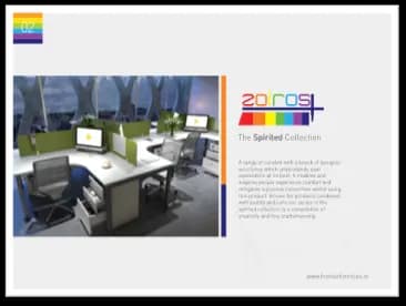
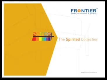
Two spreads from the corporate brochure: a collection introduced on a bold yellow cover, and product options facing a blue cover headed “Designed for the Office spaces.” The artwork is shown as produced, whole and uncropped.
The originals are small. They are shown at modest size on purpose, so they stay as sharp as the source allows.


Print advertising
Two full-page advertisements for magazines — the source names IFJ, Go-Getter and SpiceJet among them. One puts a workstation range in a working office; the other marks ten years in the industry.

The source gives no circulation, reach or response figures for these advertisements, so none are claimed.
Marketing collateral · Exhibition
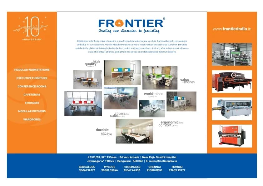
At an exhibition, the brand has to explain itself in one glance. This panel carries the same logo, orange-and-blue colours and product photography as the print work, onto a physical stand.
- 01
What the brand makes
A left panel lists the product lines: modular workstations, executive furniture, conference rooms, cafeterias, storages, modular kitchens and wardrobes.
- 02
What it stands for
A grid of furniture photographs is threaded with six short statements: high quality products, value for money, world-class designs, strong after sales service, ergonomic and comfort driven, durable and flexible.
- 03
What stands behind it
A right panel shows photographs of workshop machinery, and a blue band along the bottom carries the address and city contacts.
Read from the artwork itself. The source gives no exhibition name, date or attendance.
Restructured website
A restructured website, as it stood then.
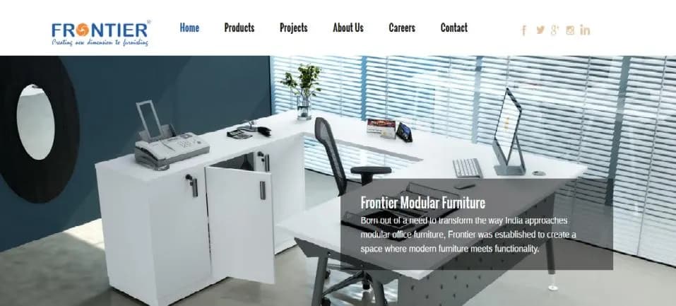
The original case study lists a re-structured website for the brand. This is its homepage as captured there: a clear navigation bar over a single, confident photograph of a workstation.
- Navigation
- Home, Products, Projects, About Us, Careers and Contact, with social icons alongside.
- First screen
- An office furniture photograph with a short statement about modern furniture meeting functionality.
- Evidence, not a rebuild
- Shown as captured in the original case study, at its original quality.
The source documents the restructuring, not the technology, features or results behind it, and none are claimed.
Social media posts
The same products, re-cut for social: a header-style graphic, an advertisement shared as a photo post, and a project-news post with a grid of site photographs.


The source gives no follower, engagement or reach figures for these posts, so none are claimed.
Corporate film
The film was scripted and shot to showcase the capability and infrastructure of Frontier Furniture. Where the other work shows the product, this shows the place that makes it.
Watch on YouTube (opens in a new tab)Linked from the original case study. Its availability can’t be guaranteed.
 Watch the Frontier Furniture corporate film on YouTube (opens in a new tab)
The film’s thumbnail, as shown in the original case study.
The documented scope
Seven touchpoints, one brand.
The original case study records the work produced, not its results. What it shows is breadth — and a single visual and verbal language holding it together.
- 01Corporate brochureTwo spreads: The Spirited Collection, and Designed for the Office spaces4 pieces
- 02Magazine advertisementLean back, relax and be comfortable, while you work1 piece
- 03Anniversary advertisementThe 10-year anniversary print ad1 piece
- 04Exhibition collateralOne full exhibition panel1 piece
- 05Restructured websiteThe homepage1 piece
- 06Social media postsA graphic banner and two posts3 pieces
- 07Corporate filmIts thumbnail, linked to the film1 piece
12pieces shown on this page — a count of creative pieces, not a measure of results.
A brand that shows up
the same way everywhere.
Print, exhibitions, the web, social channels and film: the Frontier work brings one modular furniture brand’s communication together, so each piece reinforces the next.
